Mavericks Mini
– 2013 –
UI & UX Design
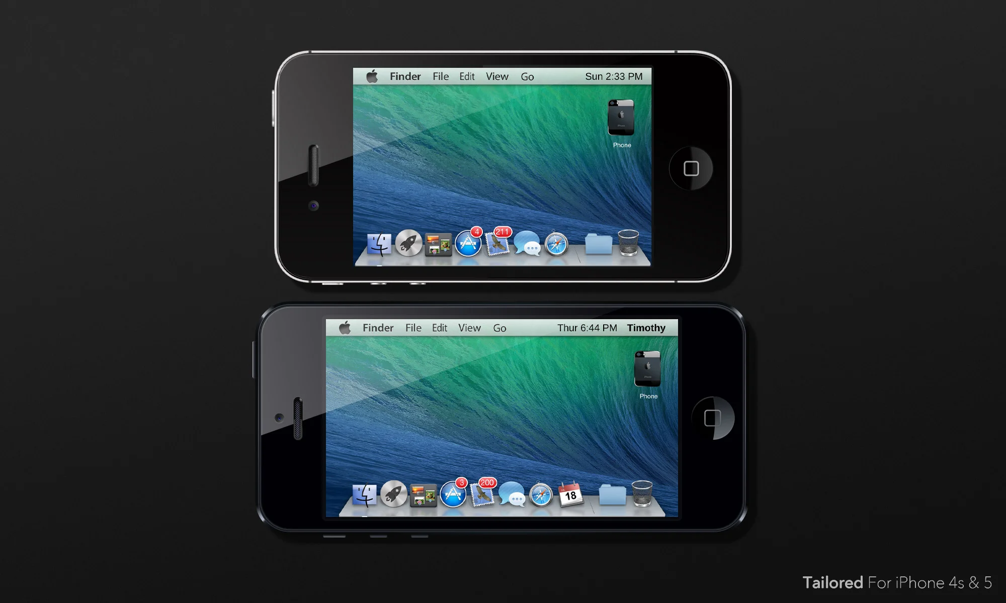
The goal of this project was to convincingly port OS X to the iPhone.
– 2013 –
The goal of this project was to convincingly port OS X to the iPhone.
Mac OS X is the reason I'm a designer today. I remember seeing OS X Leopard for the first time when I was 14 and being in awe at how beautiful it was. That was the moment I really gained an appreciation for design and knew that I wanted to work in the profession. From then on I became obsessed with the products that Apple was designing and believed that they represented the epitome of good design. And, because I wanted to be a great designer myself one day, I decided to develop my skills by trying to copy the master.
I released my first OS X emulation for the iPhone 3G when I was 16. Looking back at it now, it’s very rough around the edges. But it taught me a great deal about what goes into designing a successful user experience and it sharpened my graphic design skills. And the process was also incredibly fun. I loved the process so much that I released seven more OS X emulations for various iPhones over the next four years. Each one became increasingly more refined until I was finally satisfied that I had truly copied the master. This page is an overview of that final OS X emulation, an iPhone theme called Mavericks Mini.

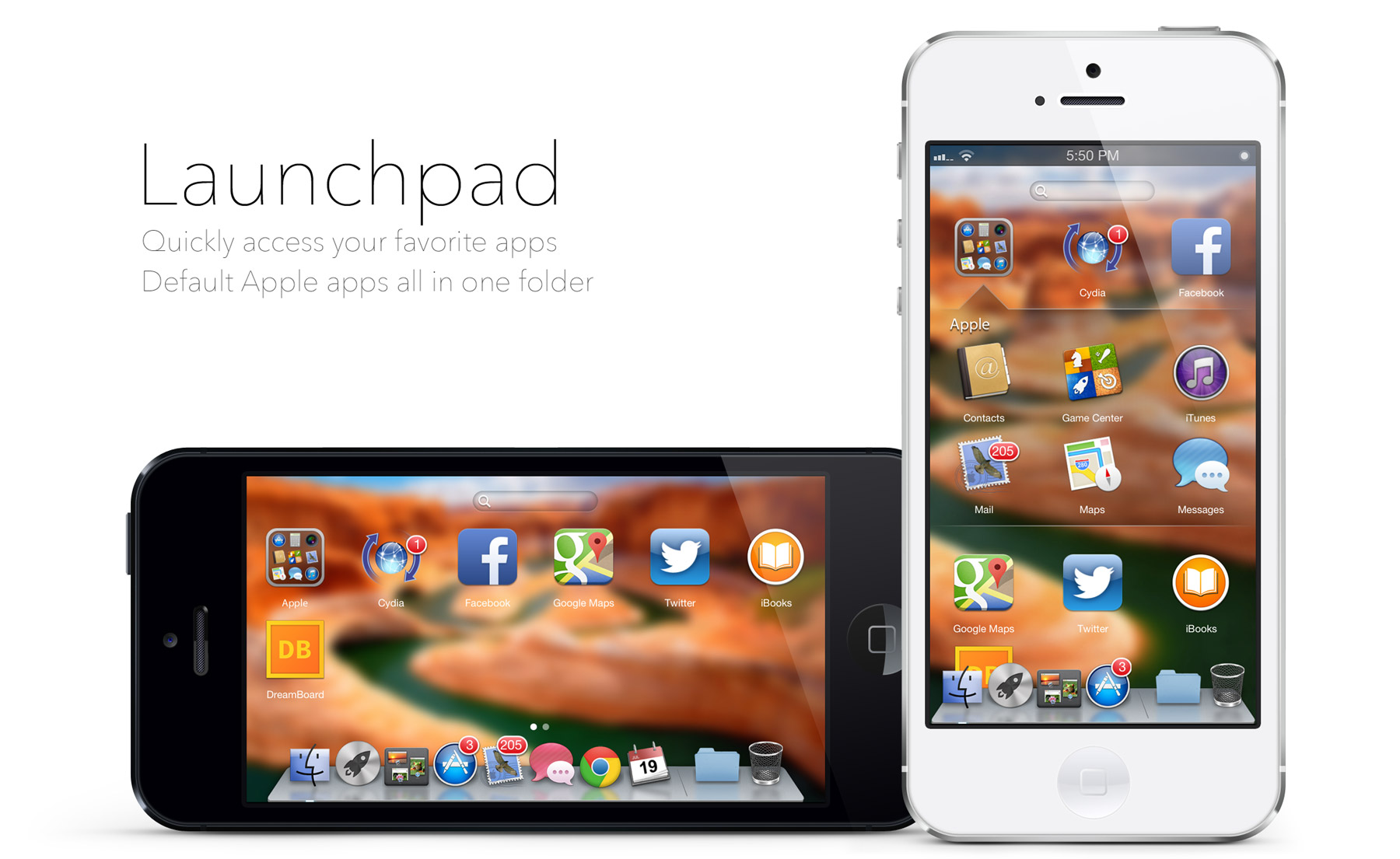
Mavericks Mini is a highly detailed theme for the iPhone 5 that requires a jailbroken version of iOS. It runs on the theme platform DreamBoard which basically uses a stripped down version of Xcode and allows people to create a whole new user interface with buttons, images, and app shortcuts. The coding language itself is very basic but, through problem solving, it's possible to create incredibly complex interactions. This whole project was essentially one giant problem solving exercise. Figuring out how to implement each core feature was a challenge in itself but the real challenge was ensuring that the multiple features played nicely with one another. The final code took a lot of planning to get right but I loved the process and problem solving that went into it. At 22,000 lines long, the code pushed the boundary of what was possible on the DreamBoard platform.

This project was not as simple as taking a screenshot of OS X and shrinking it down to the size of an iPhone screen. There's a reason Apple developed iOS for touchscreen interactions and OS X for mouse-based interactions. It all has to do with usability. Touch-based interfaces need to feel fluid and responsive while also having large buttons that are easy to tap. Meanwhile mouse-based interfaces allow for more detailed interactions due to their more precise input controls. As a result of this discrepancy, careful design thinking went into the development of Maverick Mini's interface. Three of the most notable design decisions are explored below.
Fluidity — Many of my previous OS X emulations looked good as a static screen but felt clunky to interact with. This was caused by slow, non-responsive interactions that didn't always work intuitively. For Mavericks Mini I designed the experience to be as fluid as possible so, like an Apple product, the interactions felt like they just worked. For the first time actions like launching Mission Control or using a Finder window felt natural instead of like the unnecessary add-ons in my previous emulations.
Rotation — mobile phones are one of the few devices to have a portrait oriented screen instead of a landscape screen. Naturally the most realistic OS X emulation should have a landscape layout but does that mean a compromise in usability? The reason we prefer our phones to have portrait screens is because it only requires one hand to use. A landscape interface means one hand holds the phone while the other hand taps the screen. This is simply inefficient. I addressed this problem by integrating both a landscape and portrait layout into the design. Users who want the true OS X emulation experience can opt for the landscape mode while those who want the most user-friendly interface can opt for the portrait mode. And of course switching between layouts is easy and dynamic so the whole experience feels fluid and cohesive.

Tapping — small buttons are hard to accurately tap on a touchscreen. That's why each button in Mavericks Mini was designed to be small enough to accurately replicate the look of OS X but large enough to accurately register the touch of a fingertip. For very small buttons, like the red close button of the Finder window, I added transparent padding around the image to increase the touch sensitive footprint while maintaining a small visual footprint. Designing a user-friendly user experience was a big game of optimizing image size, padding size, and button size for each interactive component.
I released Mavericks Mini for the iPhone 5 and 4s in July 2013. Since it was to be my final OS X theme I did everything in my power to ensure that the product was as perfect as possible. The attention to detail paid off big as more people began to use the theme and the reviews came in. A few large tech websites like Redmond Pie and Every Tech Pro picked up on my work and said it "looks convincingly similar to its desktop/notebook counterpart" and "everything is smooth and perfectly meets the user's actions." With Mavericks Mini I had finally achieved my goal of truly copying the master. And I had gained a deep understanding of how to design a polished UX and UI in the process.


