Flux
– 2015 –
UX & UI Design
The goal of this project was to design a better heart pump experience.
– 2015 –
The goal of this project was to design a better heart pump experience.
During my senior year at Washington University I took a course on the design of artificial organs and was absolutely fascinated by the progress being made in biomedical engineering. We were living in a time where heart transplants weren’t fully necessary anymore, where motorized heart pumps were giving patients a new lease on life. But I saw a lot of room for improvement. All of the heart pump products and interfaces on the market were designed by mechanical engineers with little consideration given to the end user experience. I knew that I could do better so I spent my free time in 2015 designing a better heart pump user experience. I called the new hypothetical product Flux.
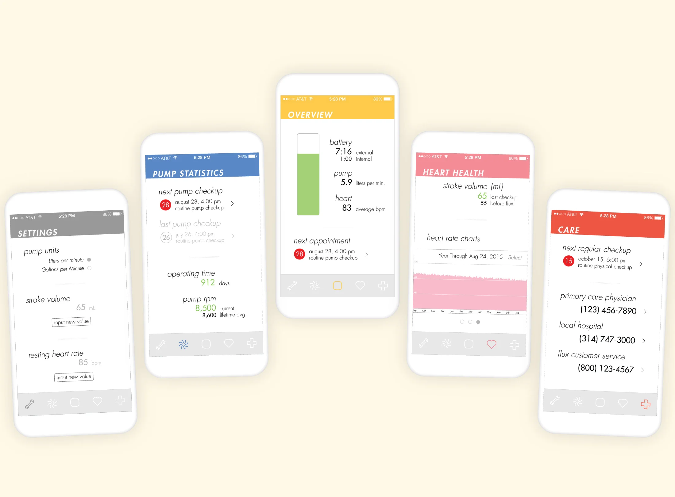
Developing a better heart pump experience starts with understanding the end user. To gain a deep knowledge of the user I read books about heart pump design, listened to patient experiences and testimonies, learned about the implant procedure and patient recovery process, and watched hands-on videos of the current products on the market. With this knowledge I mapped out the product design features that I thought would create a better user experience. After organizing my thoughts I converged on a system comprised of an implanted heart pump, a smart wearable, and a mobile app. The wearable would monitor the users heart rate and also provide continuous power to the implanted heart pump. And the mobile app would be the method of interacting with the system. It gives users relevant heart health information and guides them through the patient experience. Incorporating an app with a heart pump had never been done before so this was an opportunity to design a completely unique UX. This project was an exploration of that new UX.


The underlying premise for the UX design was complete patient care. The app was to do more than just alert the user to charge their wearable, it was to provide an engaging and worthwhile patient experience. This was achieved by giving users real-time access to data so they could track their recovery progress. The app would also alleviate the stress of routine hospital visits and checkups by integrating with the calendar and reminder apps. As a whole, the UX helps users become more comfortable living with their new implant, which allows them to quickly return to their normal pace of life.

The UI had an unusual design constraint: it had to be timeless. That’s because the UI and UX would not be receiving any updates. When a user literally has a mechanical device helping keep them alive, they need to feel a sense of trust in that device. It’s the key to a positive user experience. And the best way to build a user’s trust is by being consistent. This means no unexpected UI or UX changes–the app will look and act the same way every single time it’s opened. And this allows the app to quickly become a part of the user’s daily routine so they become comfortable using it to stay on top of their recovery. With this unusual constraint in mind, I looked to 1960’s Swiss style posters for design cues. Their use of bold colors, modern sans serif typefaces, and simple layouts has allowed them to remain stylish for over 50 years. I used similar design principles for the UI to help ensure the app would look modern for years to come. Design trends come and go but this UI should, hopefully, always be in style.

Minimalist UI’s can border on feeling boring. That’s where engaging animations make a huge difference. They allow an otherwise plain interface to feel more fluid and visually interesting. That’s why I designed micro-animations into the app wherever possible. Overall they make Flux more engaging and pleasant to use.
Dynamic interactions – the responsive animations prevent the minimalist design from feeling plain and make for a fluid experience that's a pleasure to use.
I finished designing Flux in July 2015. Though it’s just a concept and I have no intention of turning it into an actual medical product, I do think it represents a look at where biotech will go in the future. I expect to see more integration between apps, UX/UI design, and biomedical engineering as the industries mature.
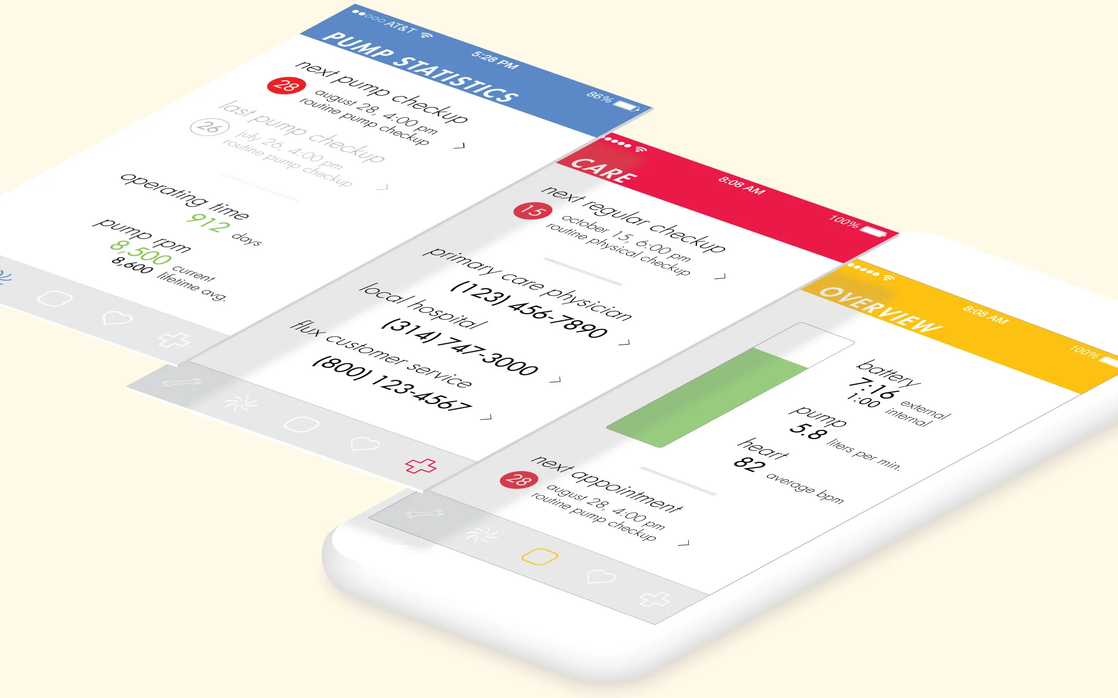
Building Confidence – Routine checkups are important for heart pump patients. The Pump Statistics section helps a user stay on top of their hospital visits and monitor their pump for any anomalies.
Monitoring Recovery – A running history of the user's heart rate is a key feature in Flux. The patient's average heart rate should gradually decrease to a healthy level over time if the heart pump is working correctly. Allowing the user to keep track of their heart rate data gives them confidence as they see their heart become healthier. And it allows doctors to monitor the effects of various medication on their patient's heart rhythm.
Centralized Care – All emergency information is in one place to help the user become more comfortable with their heart pump. They can quickly call their primary care physician or local hospital to schedule an appointment or even call Flux custom service if they have any questions about their pump.